redesigning wikipedia
Wikipedia is a multilingual, web-based, free encyclopedia based on a model of openly editable and viewable content, a wiki. By redesigning the website, where we mainly focused on the English site, we wanted to improve the user experience and make information more discoverable.
Team: Sravya Amancherla, Dhruvi Patel, Simone Pimento
Role: Interaction Designer
Client: Academic Project
Time: 10 Weeks
Tools: Sketch, Figma, Proto.io
Methods: User Interviews, Usability Testing

project
focus.
Wikipedia is a multilingual, web-based, free encyclopedia based on a model of openly editable and viewable content, a wiki. It is a trove of information with many features- most of which are unknown to a large population. Through the redesign- we wanted to improve the readability and discoverability of information- without impacting the core Wikipedia features.
We have mainly focused on the pages of the English Wikipedia site- with the original homepage linking to different language sites remaining untouched. These changes can be applied to sites in different languages.
Goals
- To improve the information discoverability.
- To make the articles more readable
- To encourage the exploration of the website
- To improve the overall experience of using the site for those seeking information.
the current website.
We created a list of use cases like simple information gathering, updating the website, discussing the page updates. etc and went through the website to understand the user flows.
These are a few of the issues we found that needed immediate attention:
Navigation
The overall navigation of the website is very confusing as there are too many links on both the top navbar and the side bar.
Discoverability
The website has many features that aren't apparent due to issues with discoverability.
Wall-of-Text
Wikipedia is very text-heavy. This creates issues with the overall readability of information.
user interviews &
usability testing.
We conducted 6 user interviews website usability tests to understand people's usage of the site: their motivations, pain points, and issues. For the scope of this project, we focused on university students who use Wikipedia to find information.
User Interviews:
The semi-structured interviews provided us with the key concerns and motivations for people around which we drove our design.
Usability Testing
Through the testing, we aimed to measure various factors that affected the user’s decisions on the website, which helped us redesign it.
User Flow Diagrams
We drew them to see how users looked for information online to understand the informational hierarchy and the various websites users go through while exploring the web.
findings & insights.
Visual Design
Good visual design improves readability and makes information easier to find. The current Wikipedia design is dated and was directly impacting the bounce rate of the website.
Information hierarchy
For a text-heavy website like Wikipedia, the information hierarchy is very important. Finding the information needed should be simple. Currently, the Wikipedia pages do not afford easier finding of information.
Navigation
Wikipedia navigation is very confusing and the names of various functionalities are very technical and hard to understand.
Discoverability
Wikipedia is a vast repository of knowledge and has various functionalities. But, most of our users had no idea about them.
preliminary design.
In the first phase of design, we redesigned the Wikipedia English main-page, the portal page for arts and science and the article page. We chose to redesign the information structure to improve discoverability. Reduced information overload and divided our pages into sections.
Some features of the article page:
- Fixed contents bar on the side.
- All the heading were made collapsible.
- Page previews for pages linked in the article.
- Option to change the language in the page itself.
- Option to toggle between normal and night mode.
the final design.
After receiving feedback on the pages, we redesigned the pages.
- We removed the colors and created a modern and clean theme.
- Redesigned to make the design consistent everywhere
- Increased readability with more white spaces.
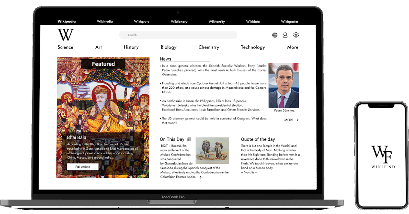
Redesigned Homepage & Portal Page
- Our home page has a link to all the Wikipedia sister projects as well as the portal pages.
- We included a featured section that changes and displayed featured articles from various portals on Wikipedia.
- The On This Day and the News column are sections that we believe would aid exploitability on the website.
- The portals page follows a similar layout to the home page so as to maintain consistency within the website.
Redesigned Article Page
- We included a collapsible content bar on the article page.
- The synopsis bar is also placed at the side so that users can find important information easily.
- All the sections are collapsible and the images are included within the body of the text.
- We included higher quality and bigger images to make the article page more interesting and visually appealing.
next steps.
After this, we designed a sister AR app for Wikipedia that uses the cellphone camera to capture images and displays information on screen sourced from Wikipedia.